
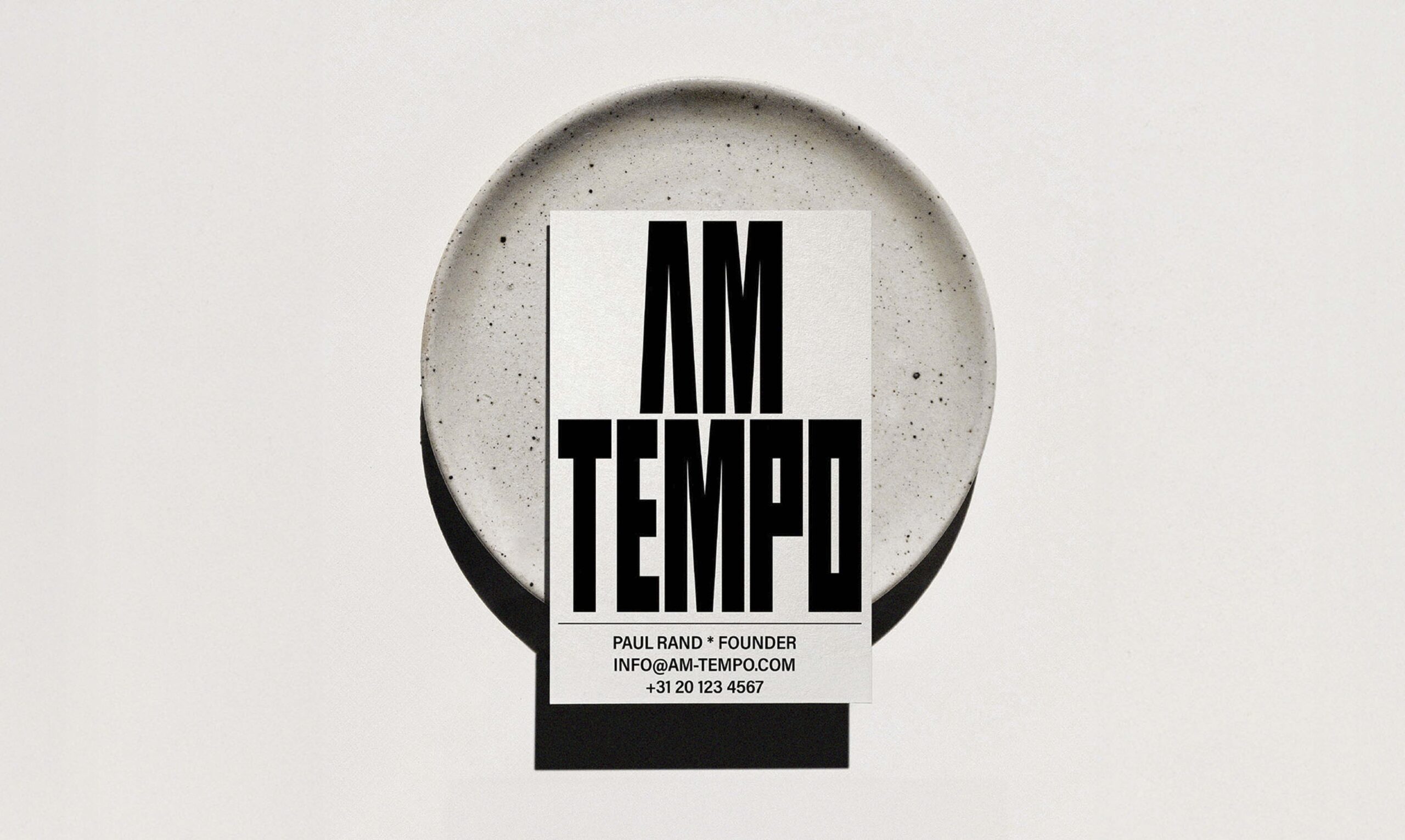
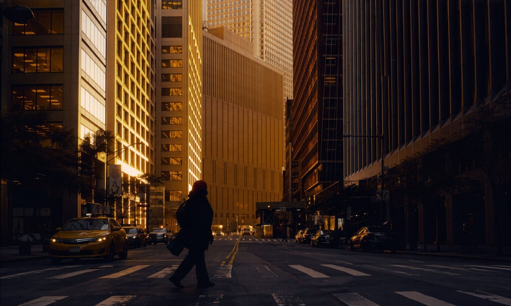
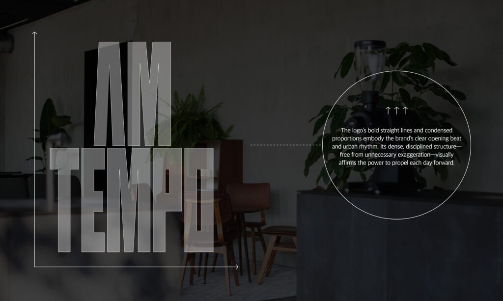
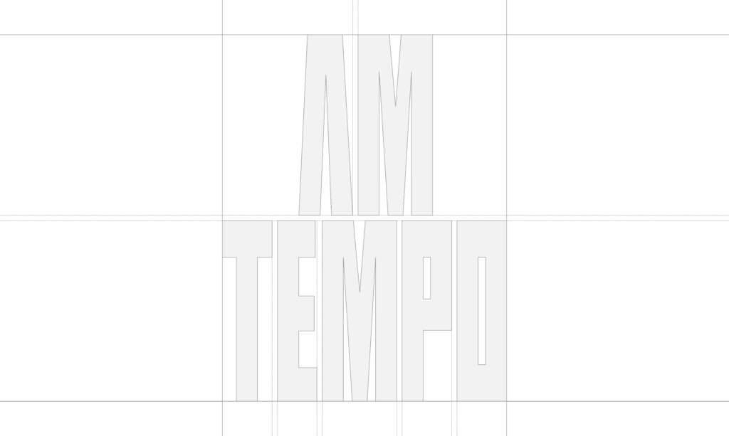
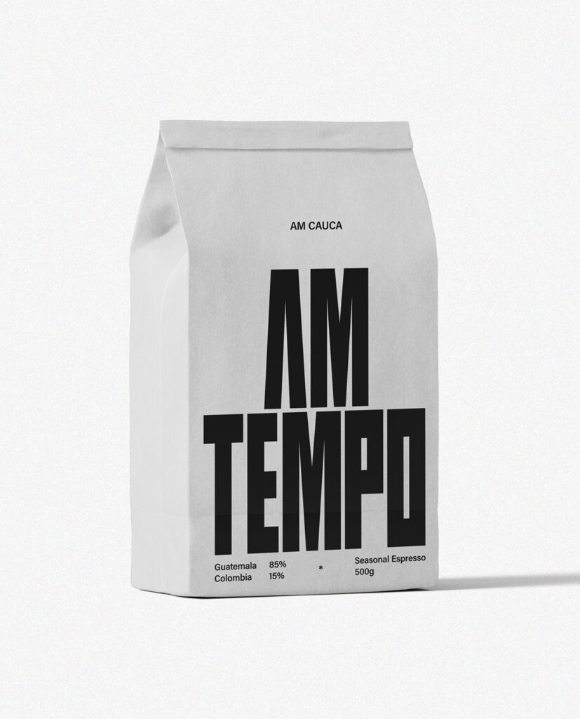
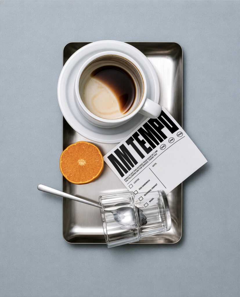
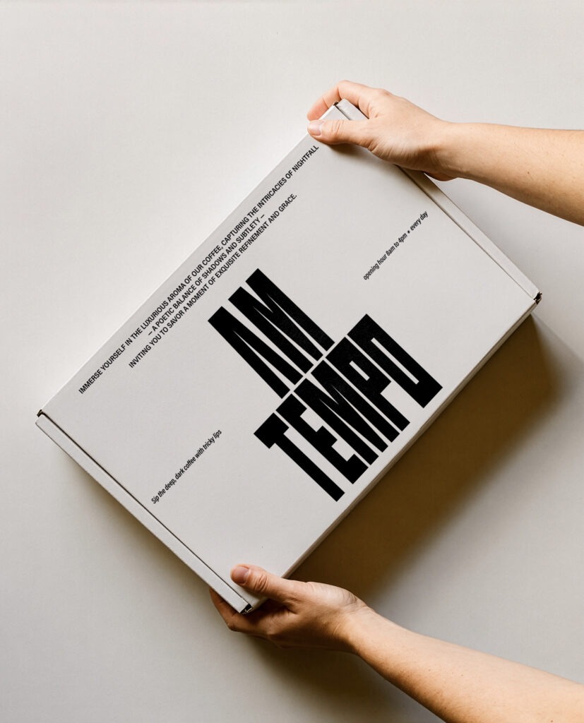
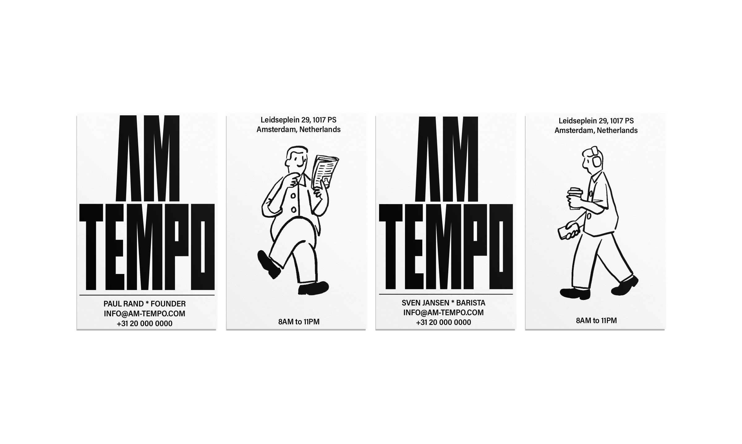
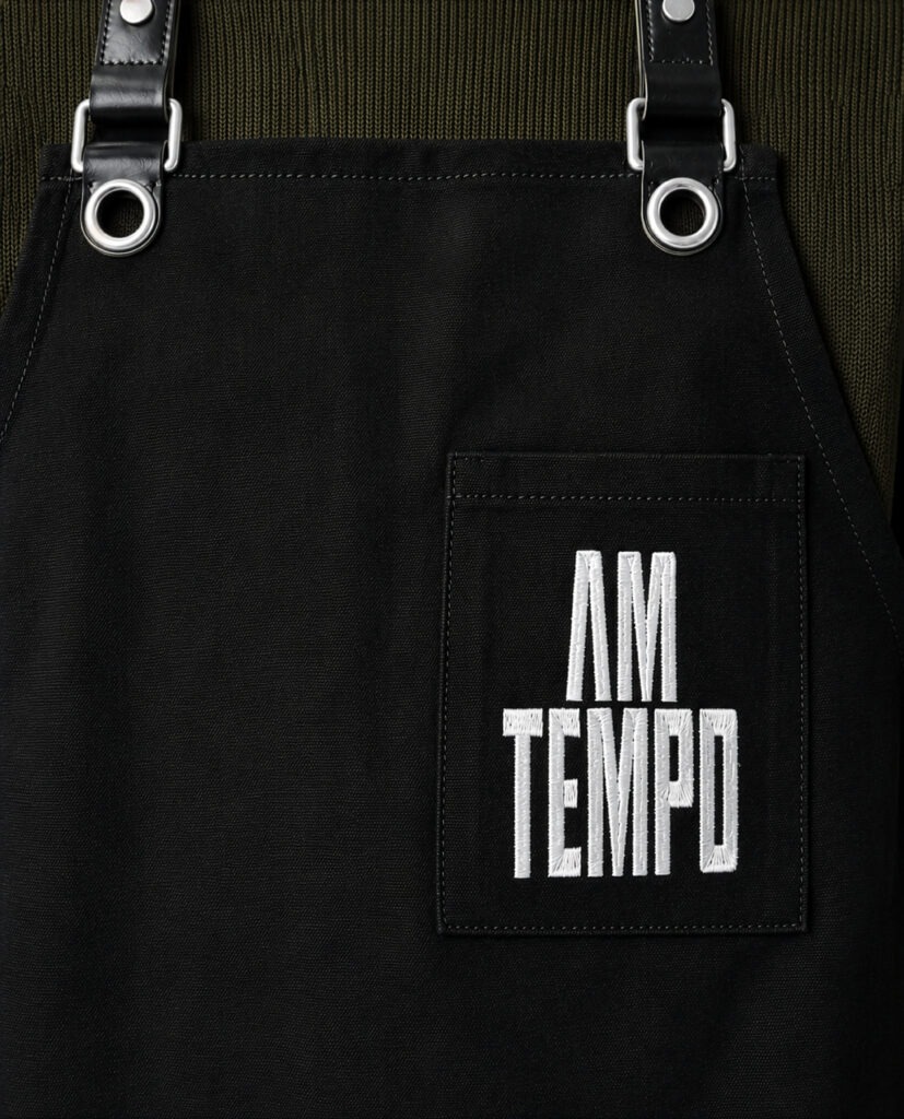
AM TEMPO is a Dutch coffee brand that awakens the early hours of the day. We define the brief yet distinct beginning created by a cup of coffee as the “first beat,” translating this idea into the brand’s visual language. Strong linear forms, condensed proportions, and densely structured graphics express a sense of urban tension and momentum. This consistent rhythm extends across packaging and spatial applications, creating a clear and distinctive brand experience unique to AM TEMPO.
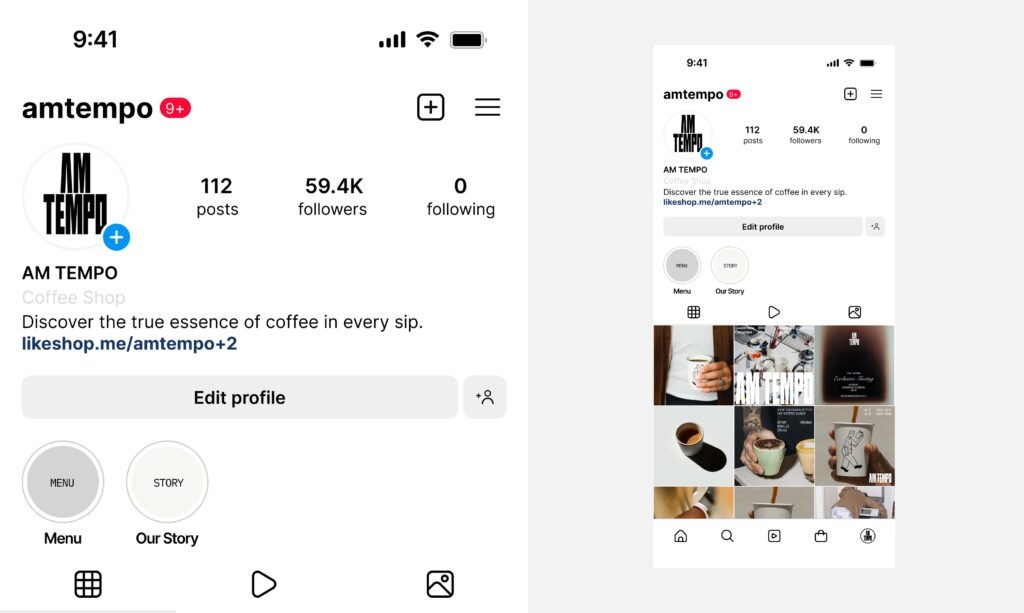
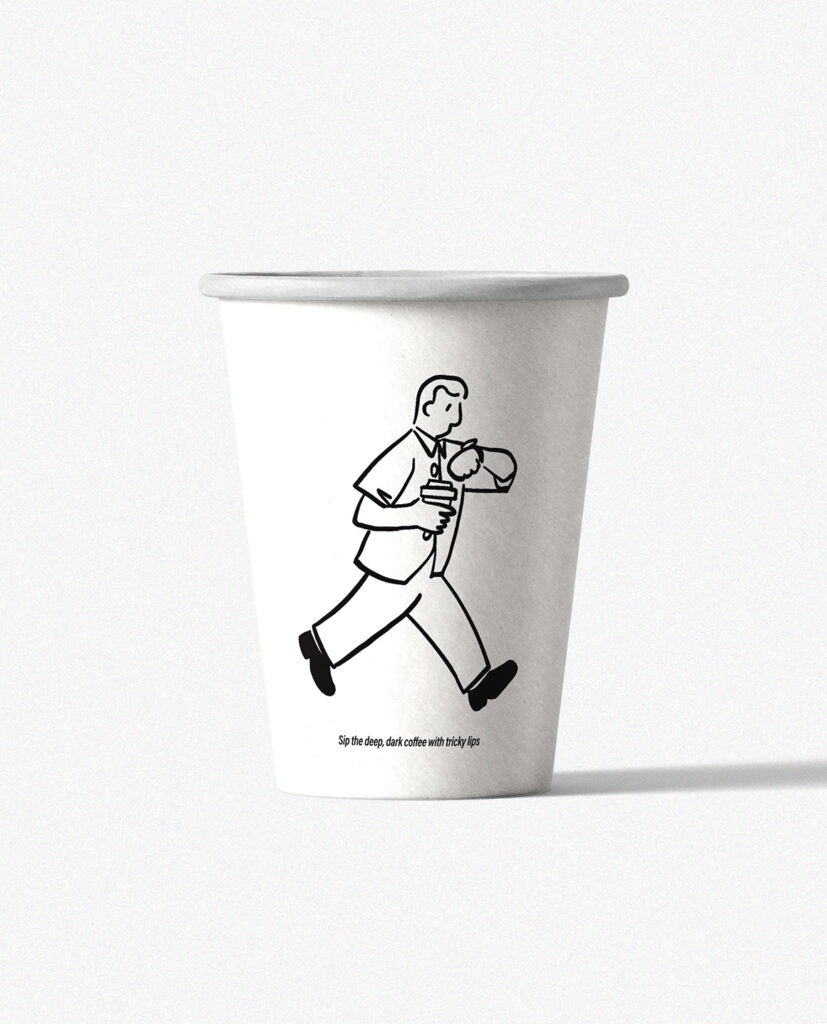
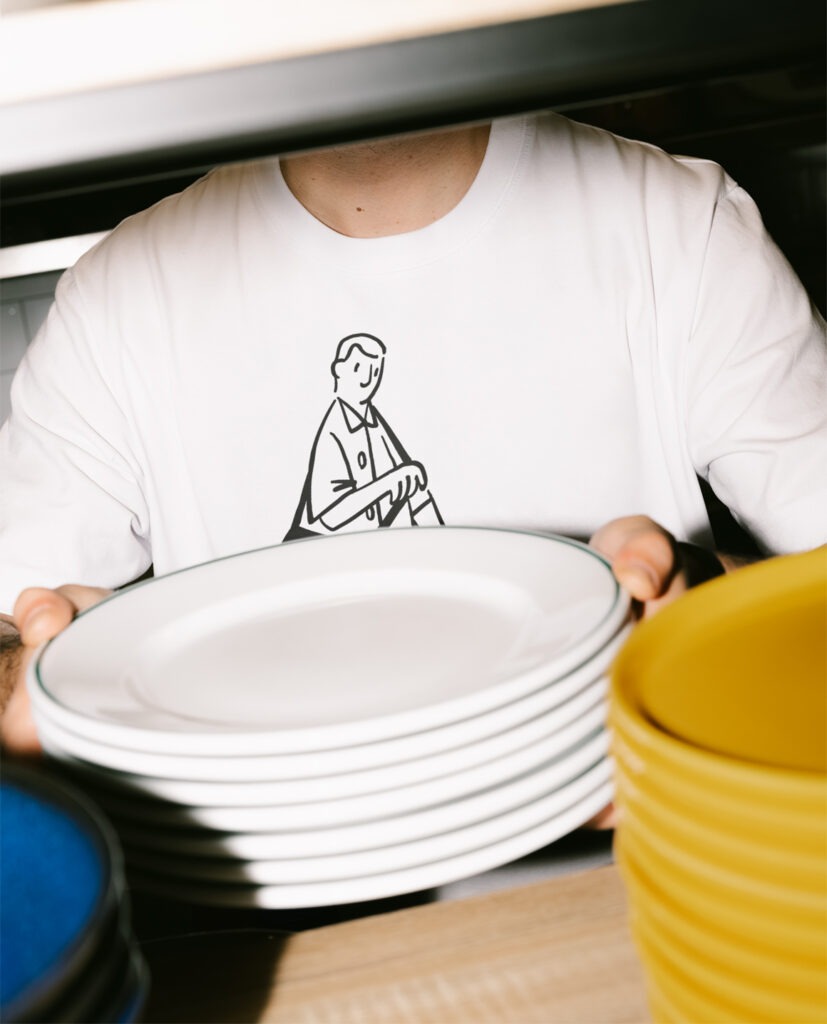
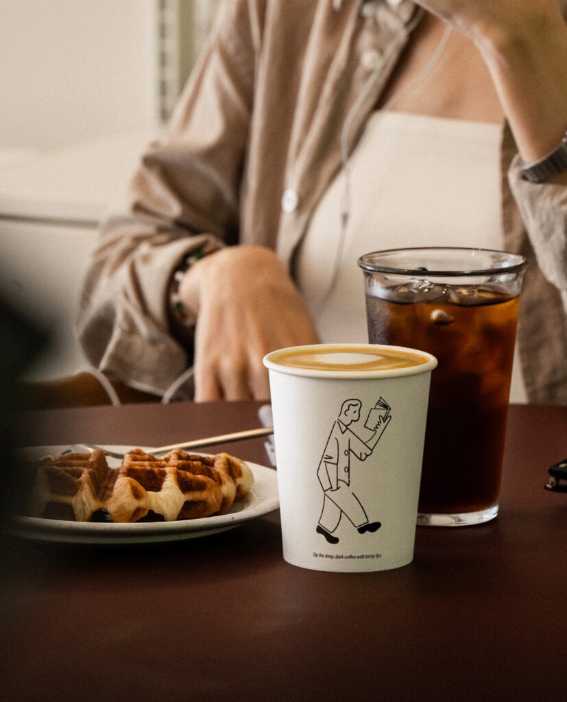
AM TEMPO’s illustrations visualize the everyday lives of people moving through different rhythms. Moments of walking, running, pausing, and focusing are expressed through simple lines and natural gestures, with an emphasis on universal actions rather than specific individual characteristics, allowing anyone to relate them to their own daily life. Composed of distinct scenes, the illustrations connect different paces of living into a unified visual rhythm, serving as a graphic language that conveys AM TEMPO’s approachable and flexible identity.


Client : AM TEMPO
Year : 2023
Creative Direction : whywhy studio
Graphic Design : Yeoho Kim