

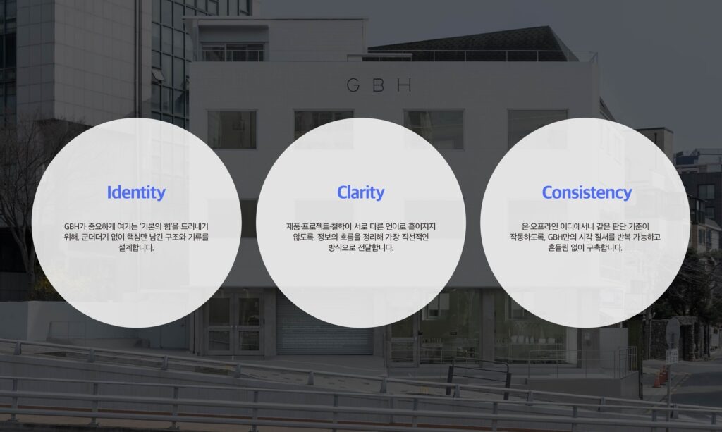
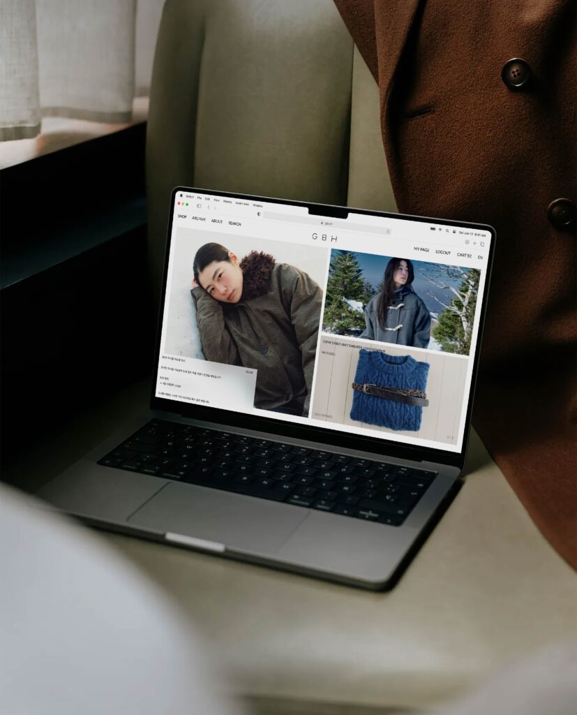
GBH is a lifestyle brand that values both visual beauty and practical use, creating products designed to remain part of everyday life over time. The restrained forms, refined textures, and balance between function and aesthetics found in its products were extended into the visual language of the website.
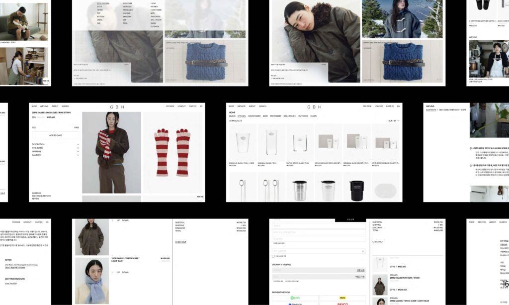
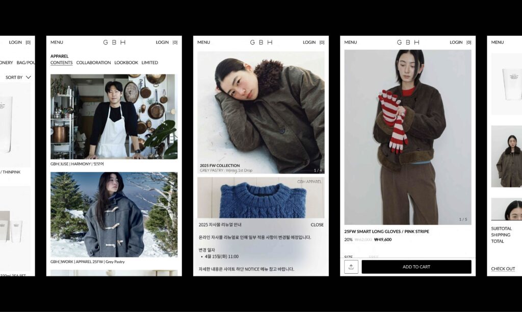
A concise layout, generous use of white space, and an image flow that naturally highlights materiality and atmosphere preserve GBH’s calm and refined character. The information architecture was organized so that diverse categories and content connect within a seamless flow, allowing the process of exploring the brand and its products to become an experience of GBH’s sensibility in itself.
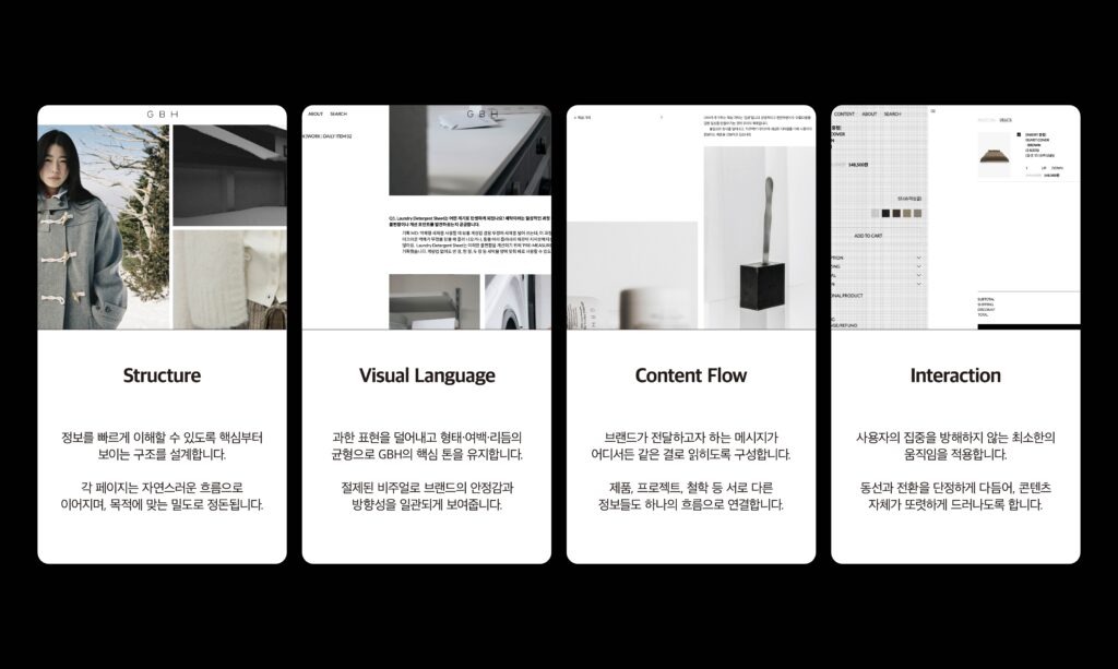
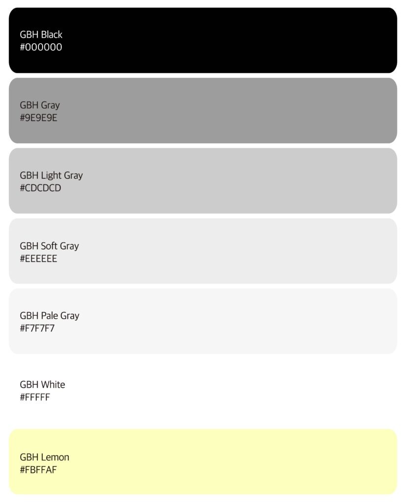
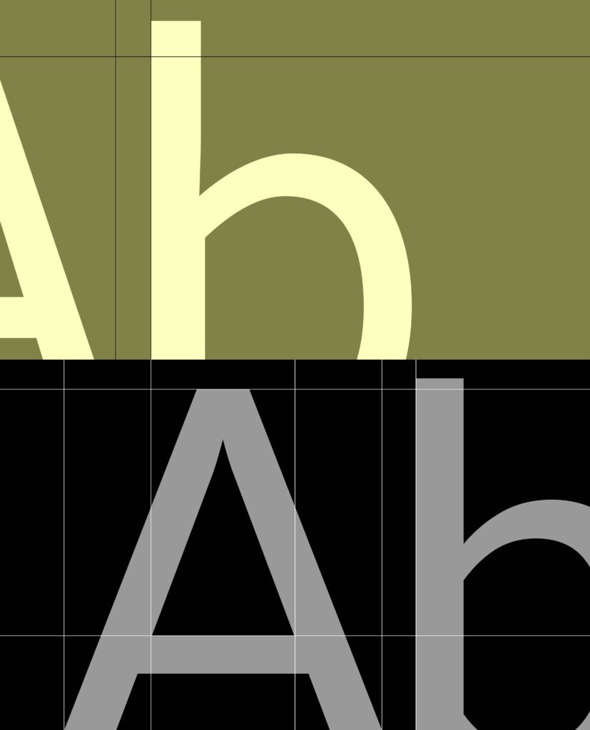
Built around Black, White, and a graduated Gray Scale, the system creates a restrained visual environment that reflects GBH’s refined identity. A clear typographic hierarchy and structured grid organize content into a consistent and intuitive flow. GBH Lemon is introduced not as a constantly visible brand color, but as an interactive accent that appears only when users select text. By adding a subtle visual response to user interaction within an otherwise minimal palette, the system creates a refined digital experience unique to GBH.

Client : GBH
Year : 2025
Creative Direction : whywhy studio
Design : Yeoho Kim
Develop: Yonggi Jeong
Motion Design: Seunghyeok Ban