
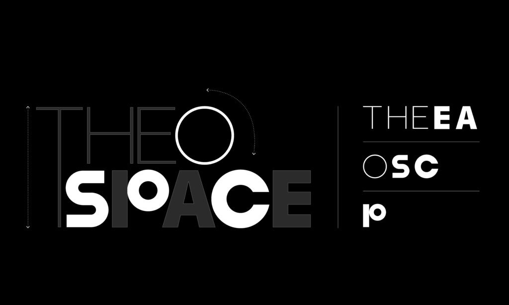
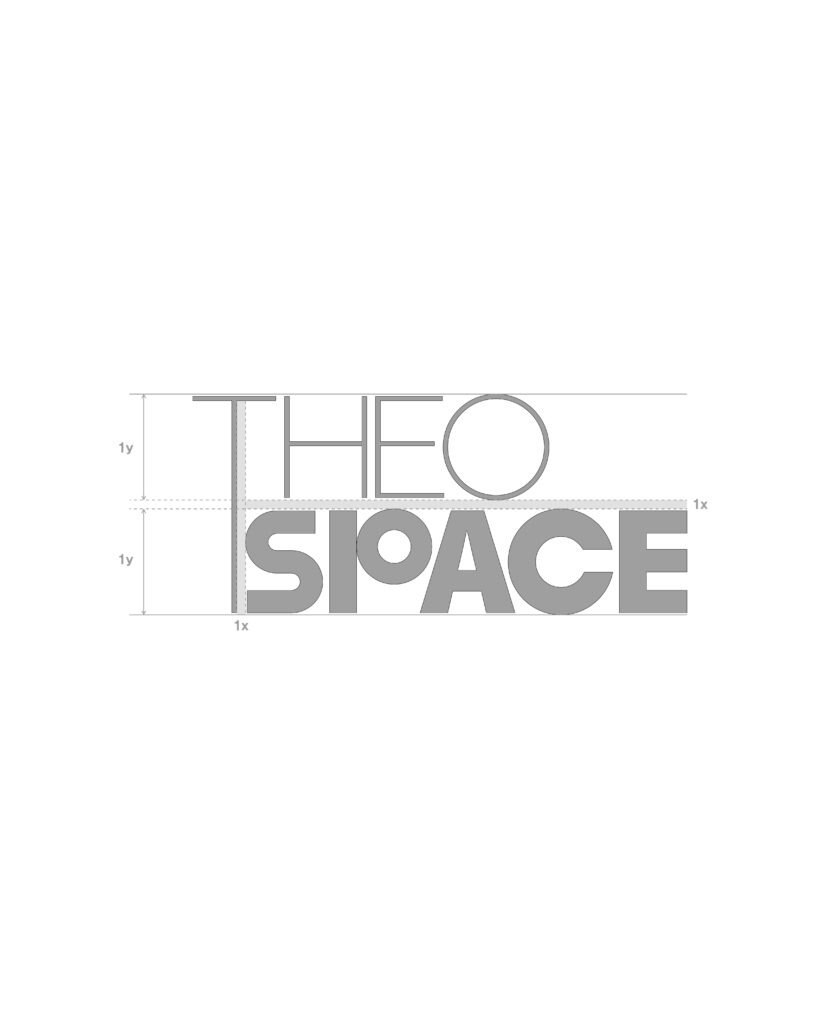
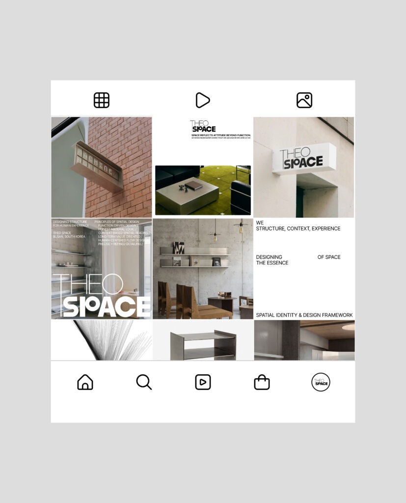
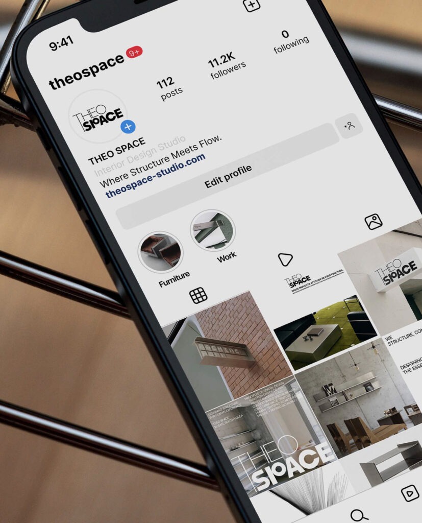
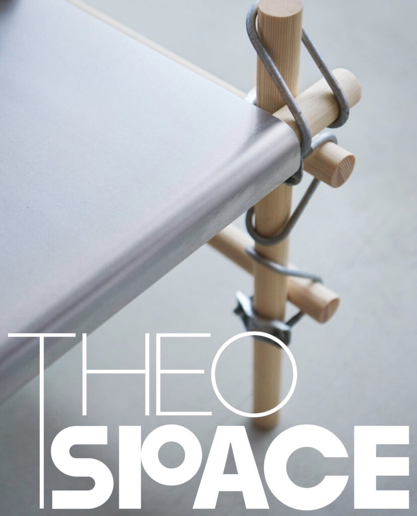
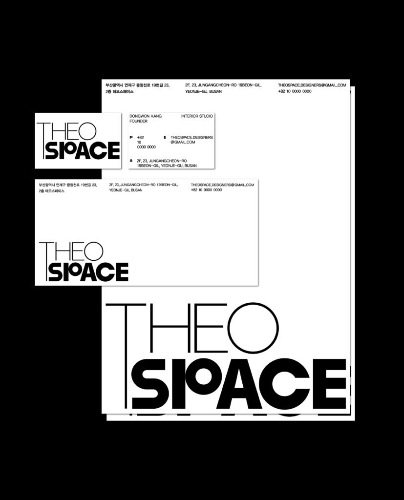
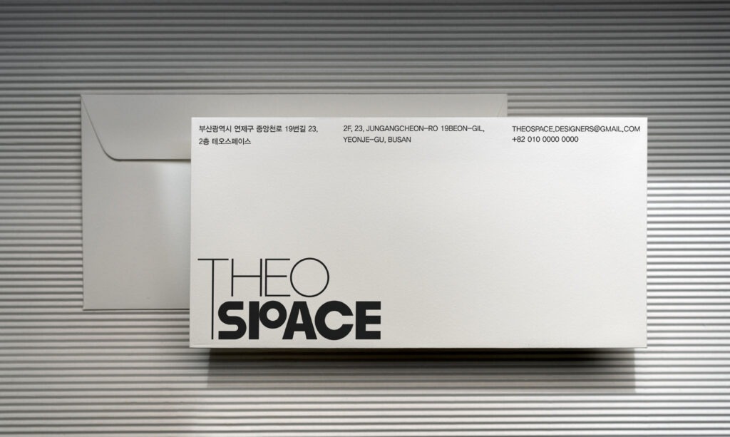
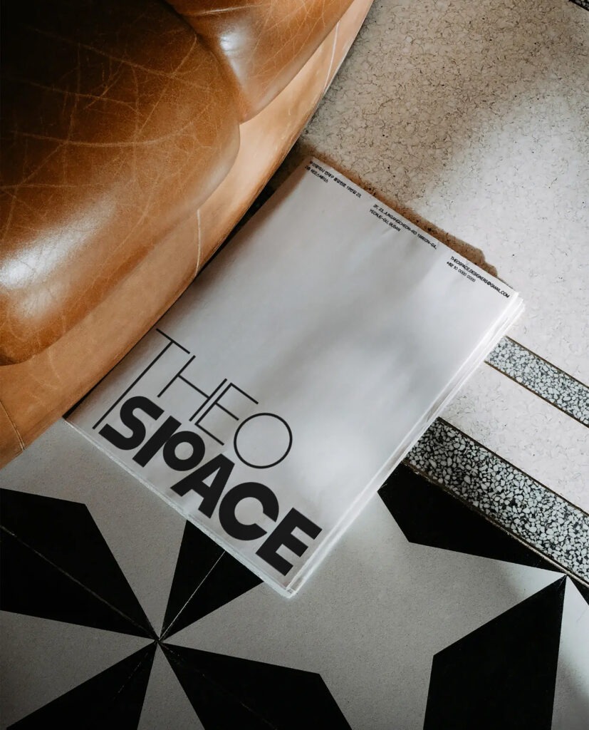
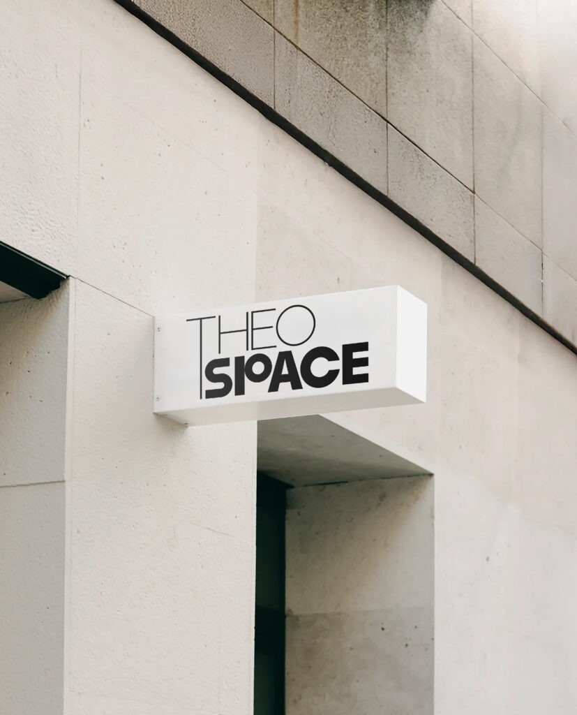
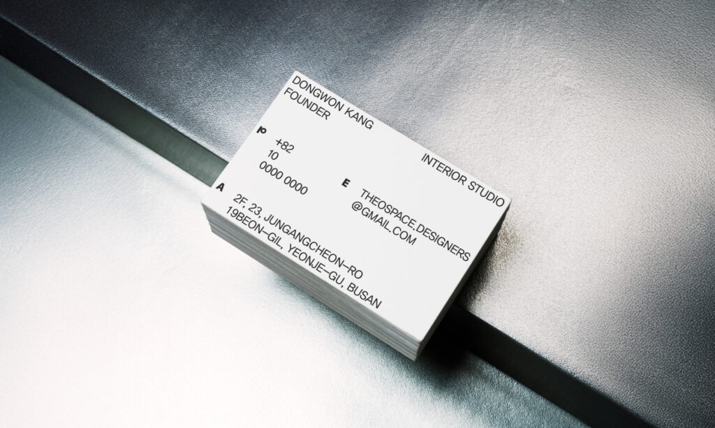
The logotype reflects the brand’s dynamic nature, where space and people intersect. A combination of straight lines and curves visualizes the balance between structure and flexibility. The letters T, H, E, and A emphasize linear forms, while O, S, and C highlight curved forms. Centered around the intersecting P, the design creates a distinct sense of spatial rhythm and tension.
Client : TEHO SPACE
Year : 2024
Creative Direction : whywhy studio
Graphic Design : Yeoho Kim