
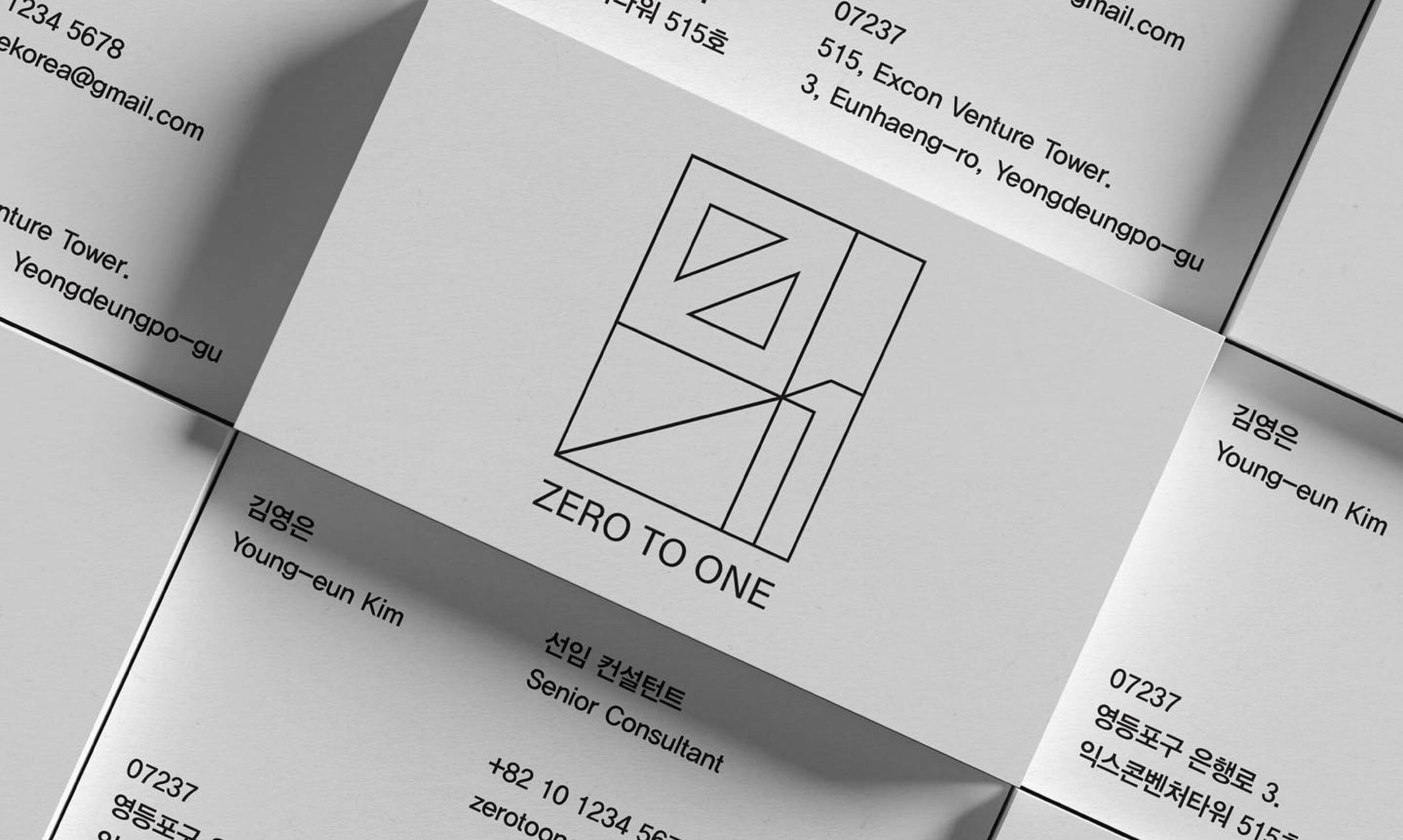
ZERO TO ONE supports startups in taking their first leap from possibility to real business. Centered around the idea of moving from “Zero to One,” the identity translates the energy of transformation and expansion—from initial ideas to action—into a cohesive visual language.
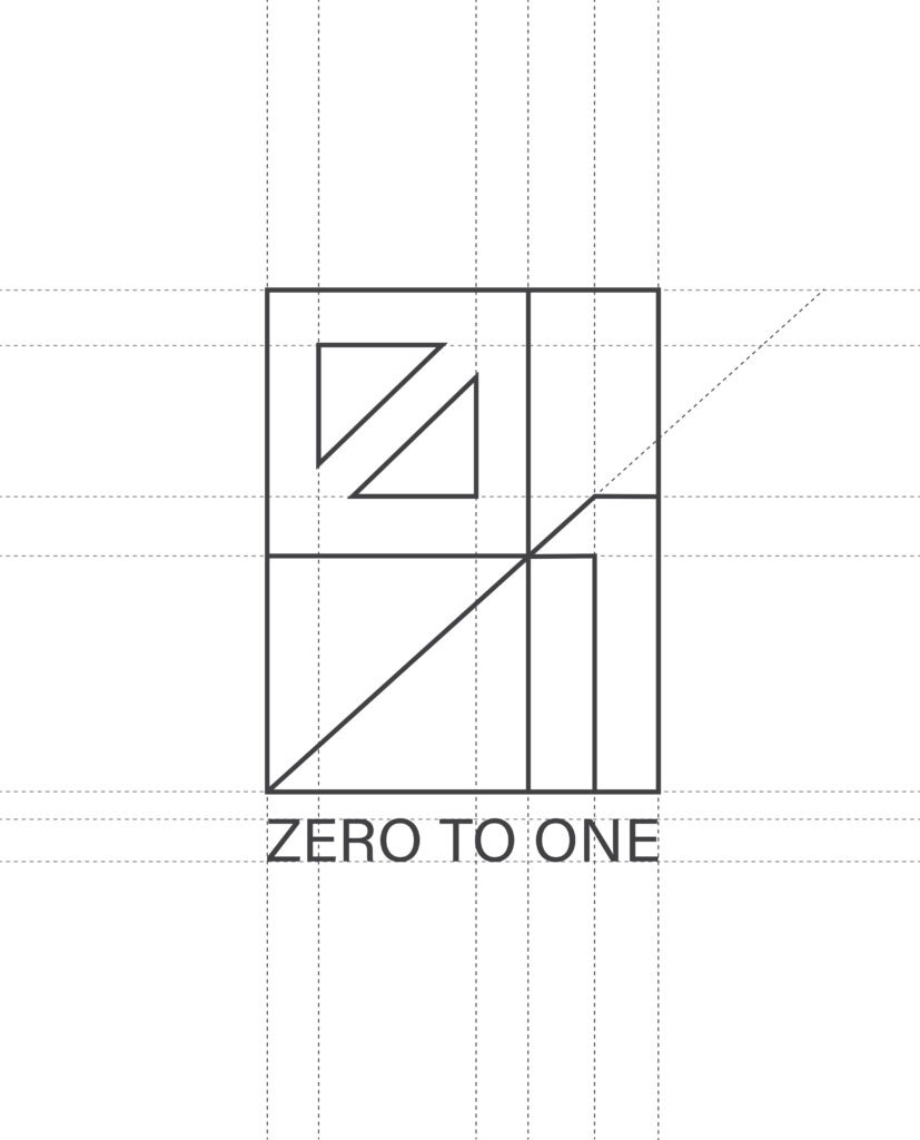
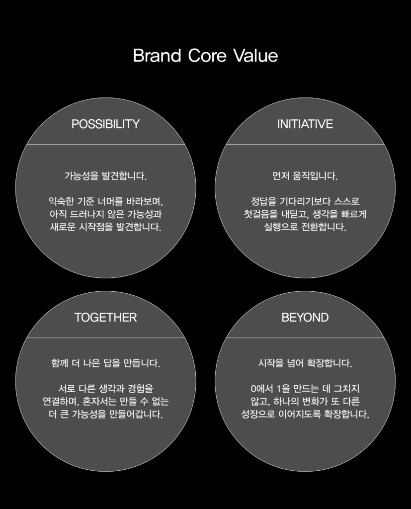
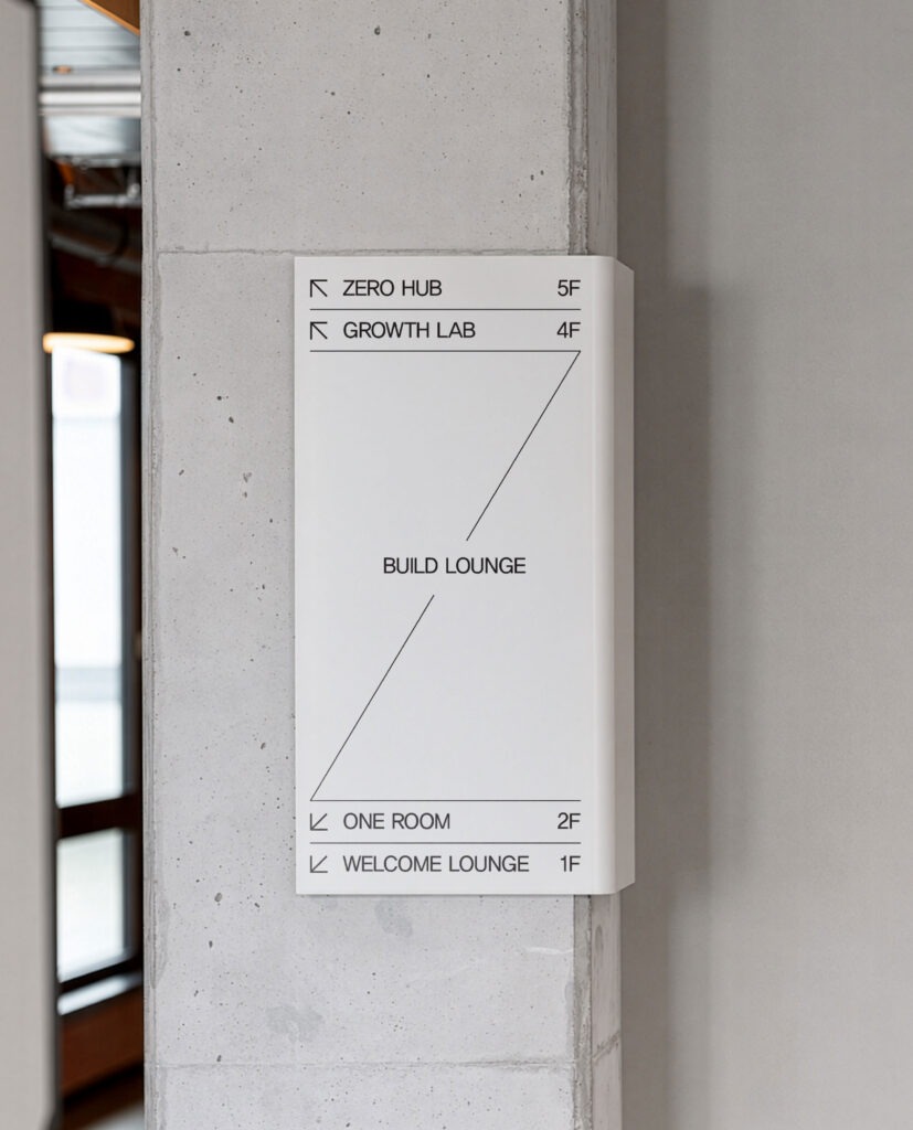
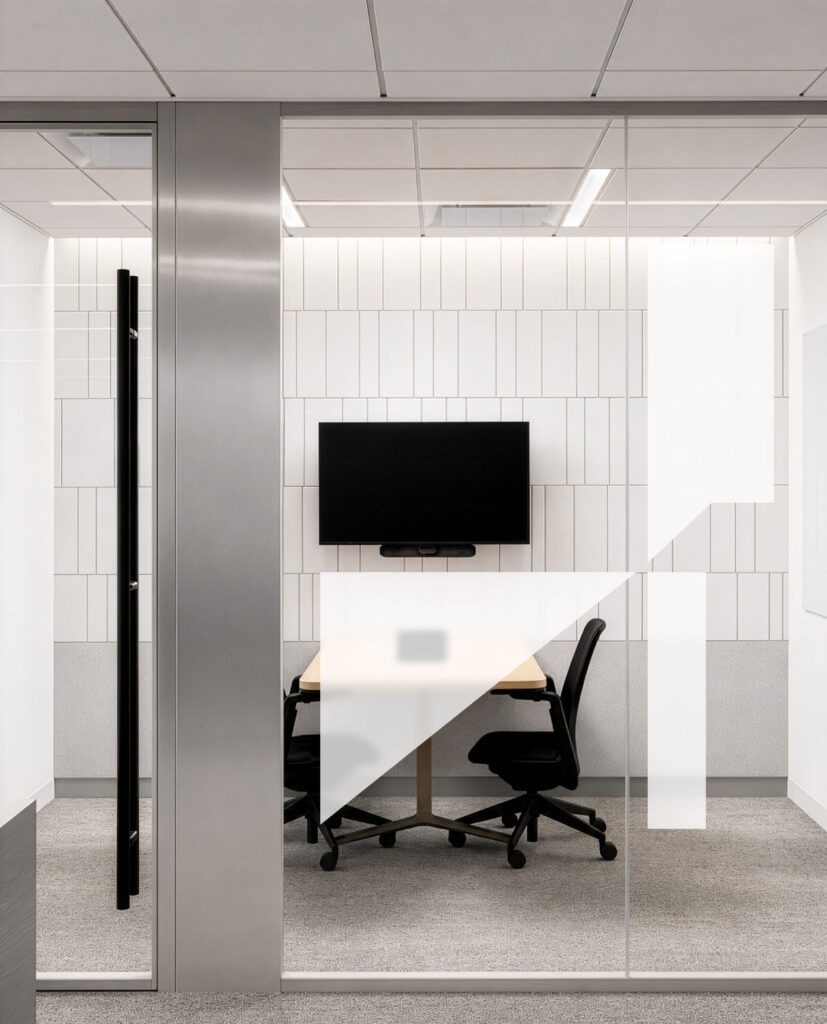
ZERO TO ONE’s journey from zero to one is expressed through an evolving system of lines and structures derived from the logo. Connections between lines and planes, along with a sense of direction and expansion, create a consistent visual flow across signage, glass applications, and door graphics. This spatial identity extends the brand’s core ideas of beginnings and forward momentum throughout the environment.
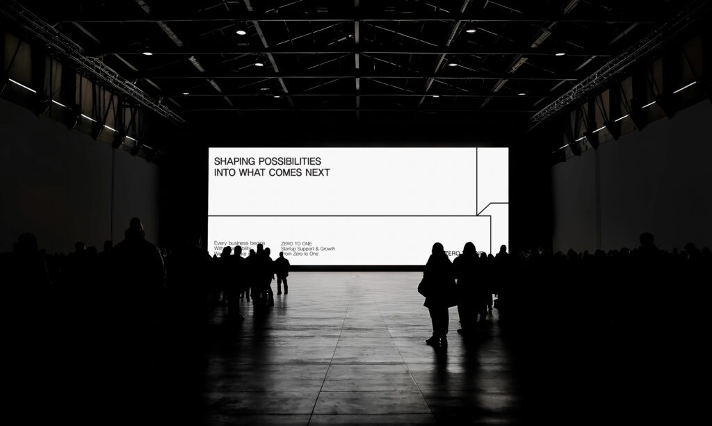
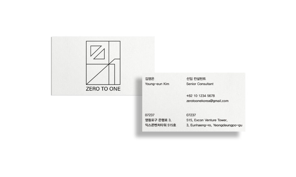
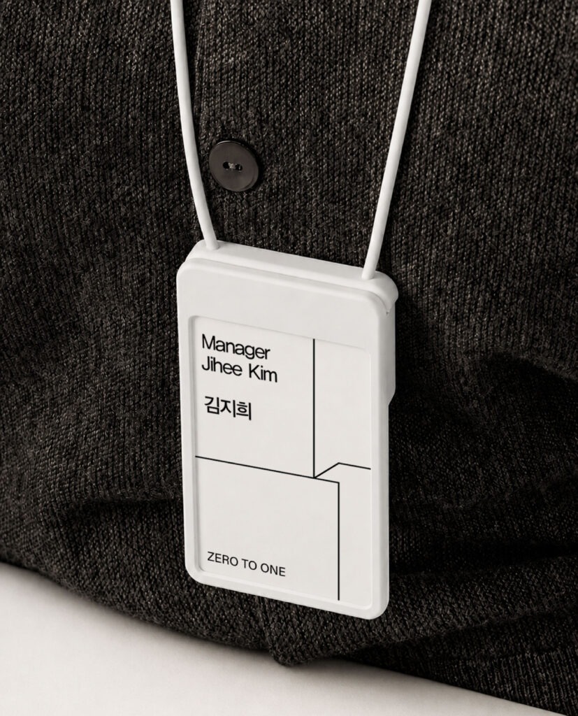
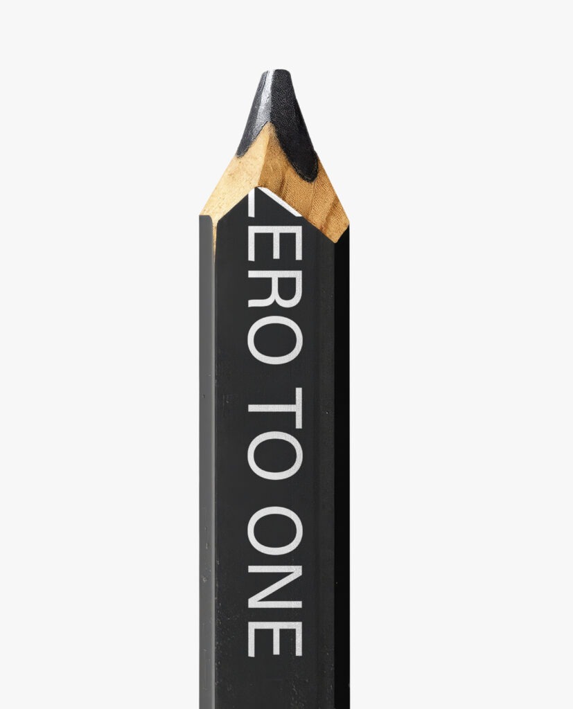
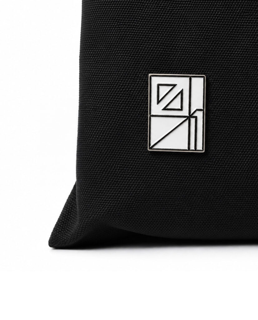
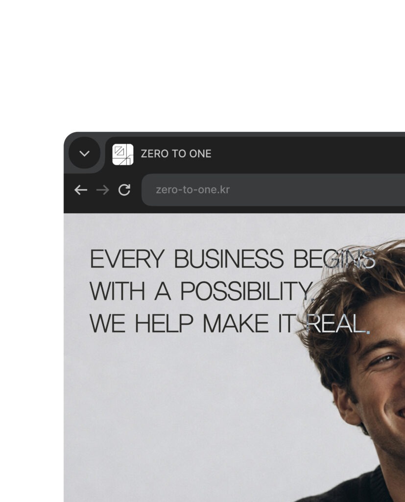
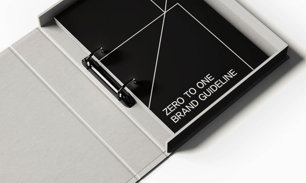
ZERO TO ONE’s brand guidelines were developed to ensure a consistent identity across a wide range of applications. The logo, typography, color palette, graphic motifs, and key application principles were organized into a cohesive system, establishing a clear foundation for the brand’s continued use and expansion.
Client : ZERO TO ONE
Year : 2022
Creative Direction : whywhy studio
Graphic Design : Yeoho Kim
Motion Design: Seunghyeok Ban