

AM TEMPO
branding, 2024
design:
Yeoho Kim
client:
AM TEMPO
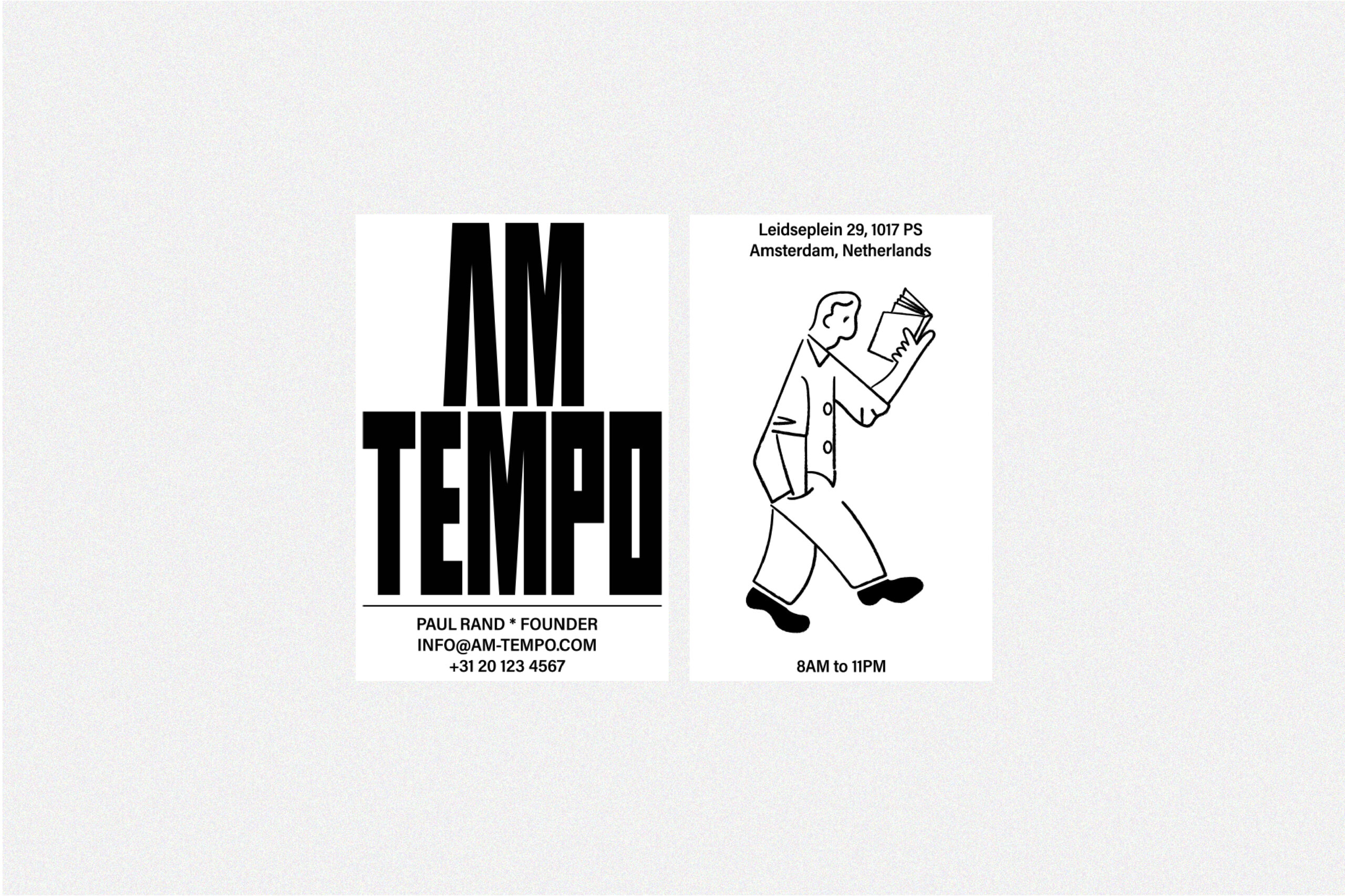
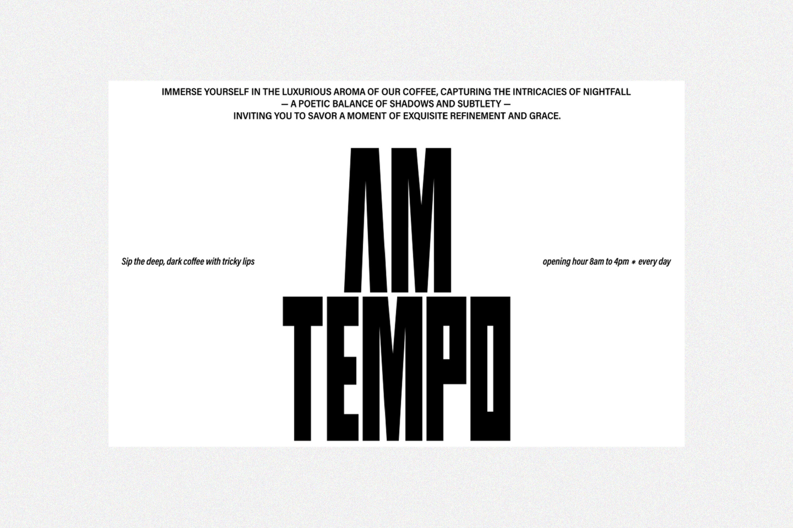
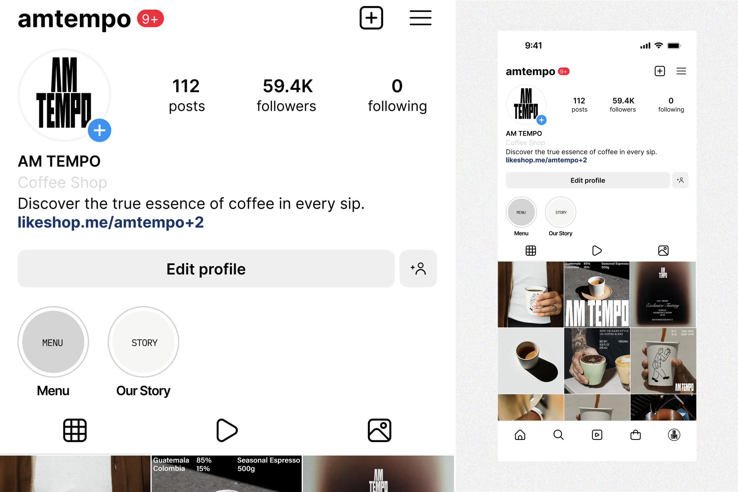
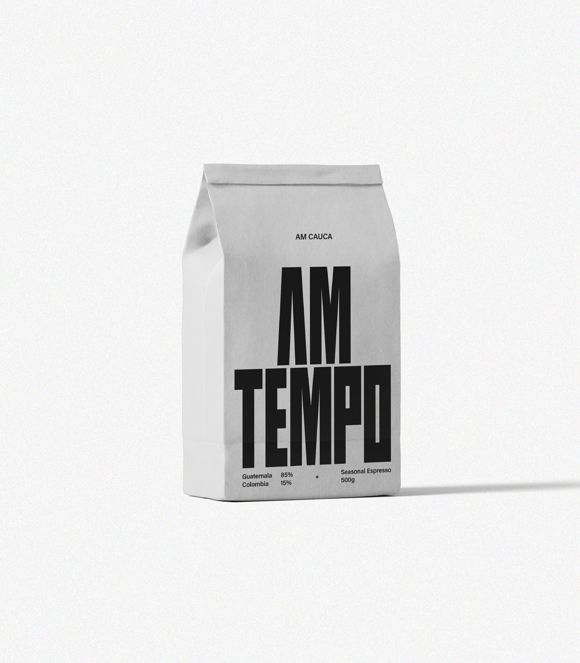
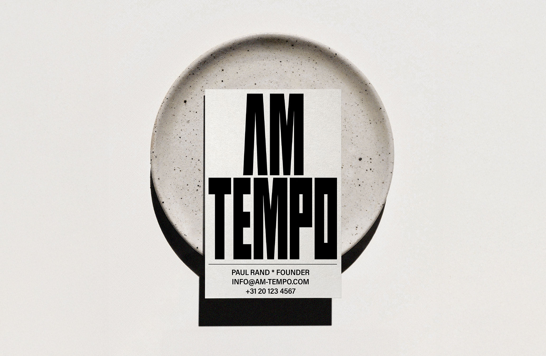
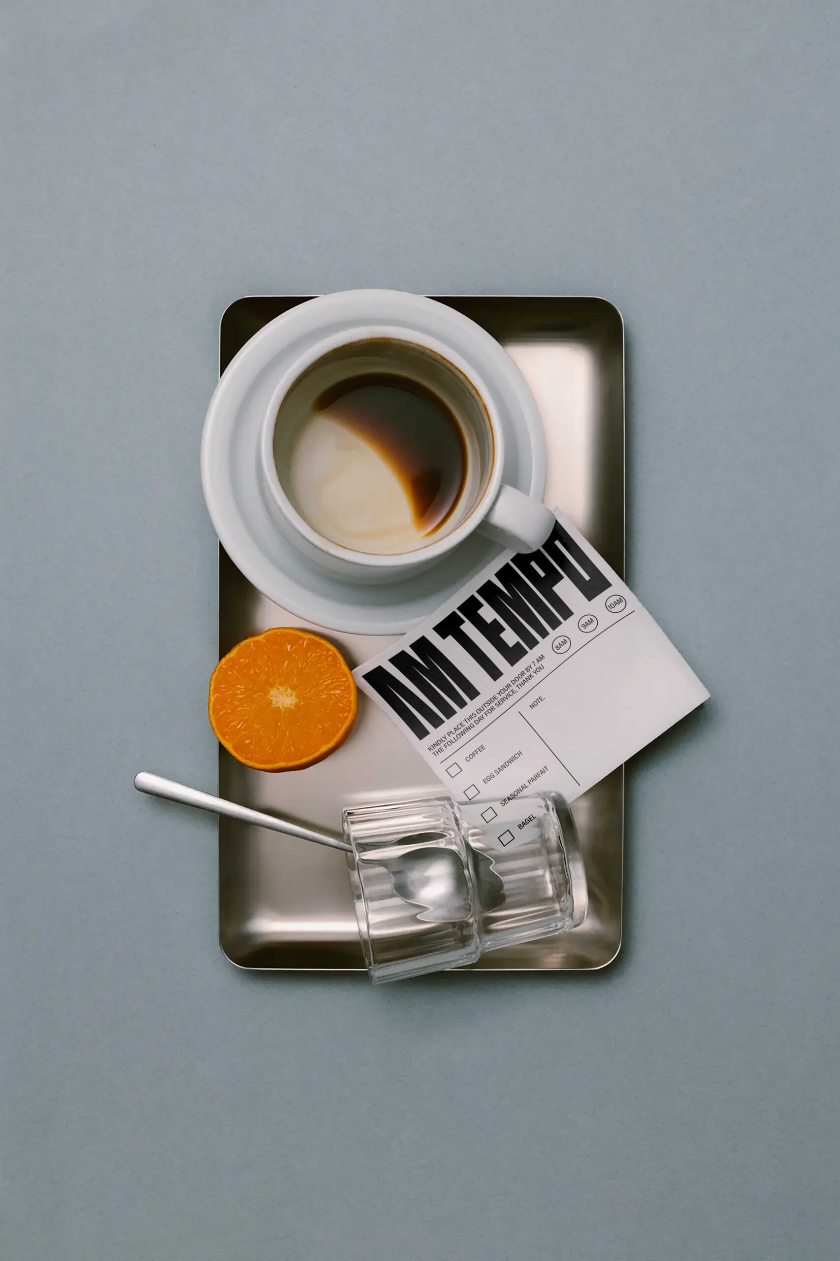
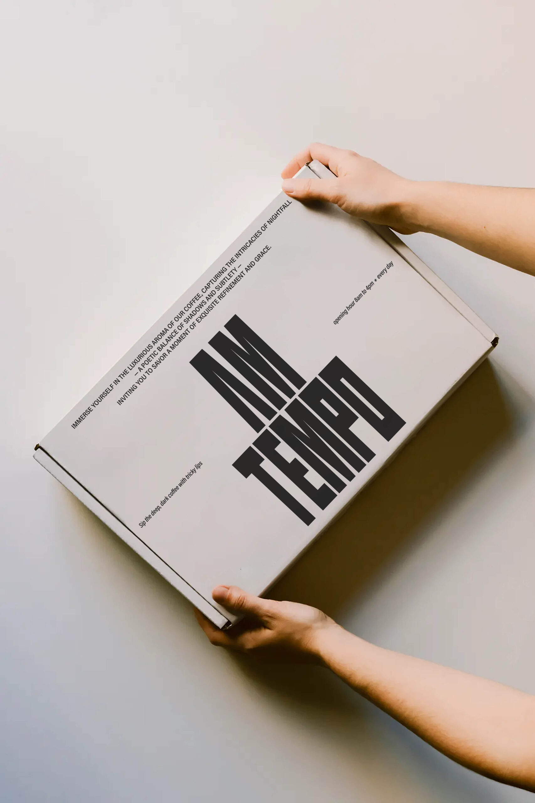
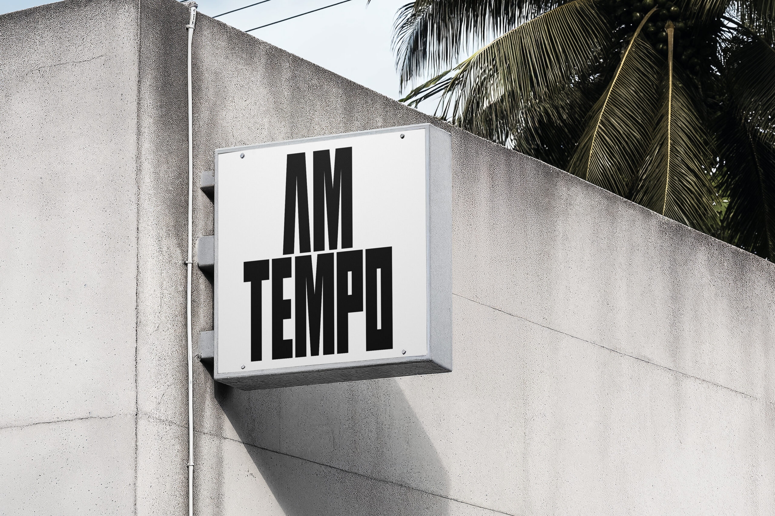
AM TEMPO is a Netherlands-based coffee brand that seeks to express the sense of time and aesthetic sensibility found in coffee through its visual language. This identity renewal project focused on interpreting the brand’s core themes — “rhythm within slowness” and “the quiet encounter with coffee” — into a cohesive visual system.
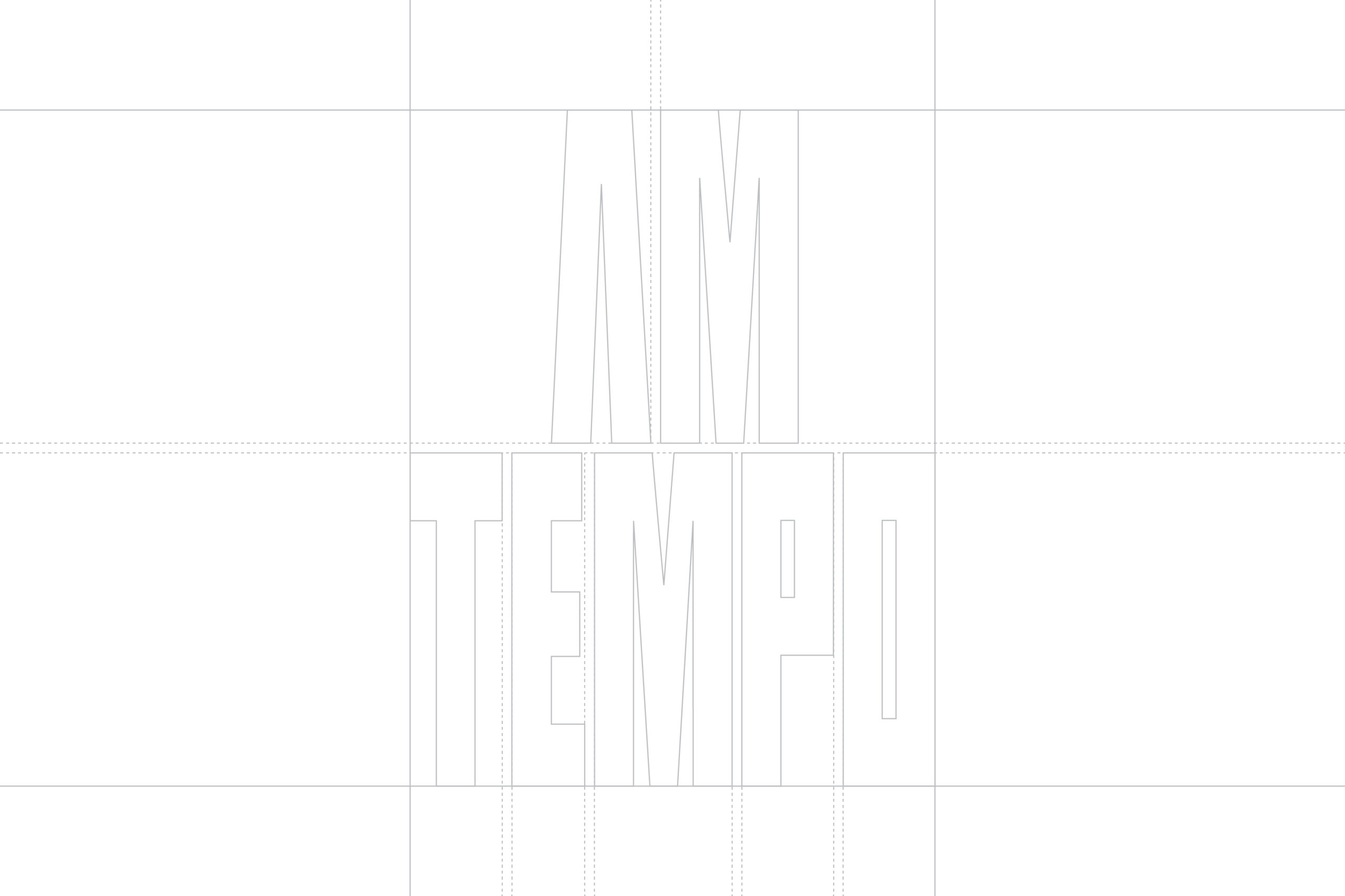
To structurally convey the brand’s attitude, the design adopted a vertical layout grid, while the packaging and brand applications were developed on a unified modular system. This ensures consistent rhythmic patterns and a spatial sense of balance across every touchpoint — from cup holders and bean packages to social media content.
The module itself symbolizes the sensory flow of coffee: the stillness before brewing, the dynamic rhythm of extraction, and the calm that follows each sip — a visual translation of AM TEMPO’s measured, contemplative pace.