TUNNEL
posters, 2024 420×594 mm (A2)
design:
Yeoho Kim
client:
Fishjellychips
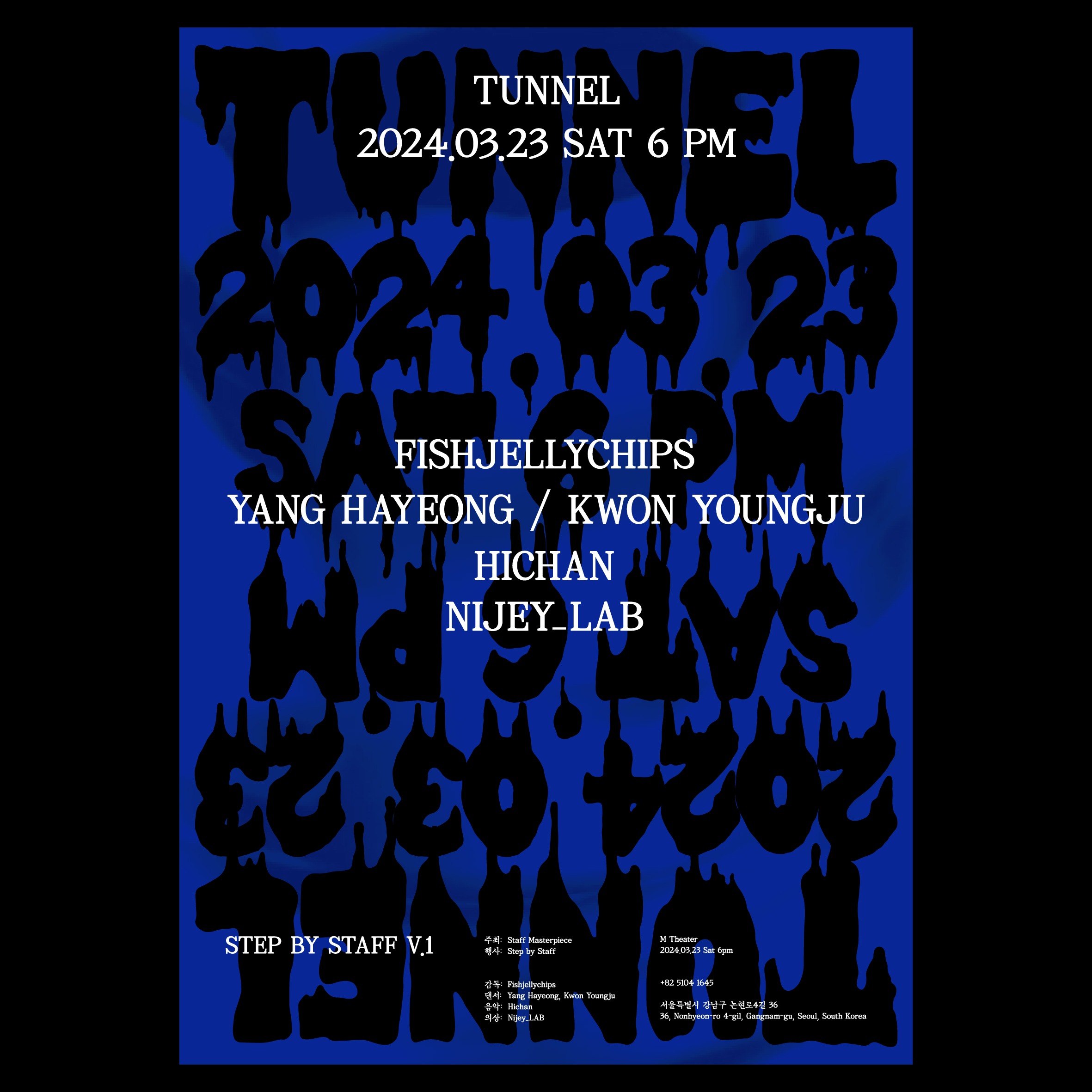
The performance Tunnel explores the fragmented nature of memory and the fluid movement of emotions on stage.
whywhy studio visually extended this concept by translating the gradual distortion and dissolution of feelings into typography and tonal density.
The poster features bold, cobalt blue tones overlaid with black, liquid-like typography. The melting letterforms symbolize the psychological state in which memories lose their shape and merge into one another, while the layered repetition of text visually embodies the overlap of time and the confusion of consciousness.
The blue background conveys both emotional depth and unstable serenity, and the use of matte texture and high-contrast black transforms the poster into a psychological space in itself. At the center, clear white typography presents essential performance information, balancing the visual tension and fragmented emotional layers that surround it.